The Bould Design Mantra: Function, Simplicity, Quality, Character
By Fred Bould, Founder and Design Director at Bould Design
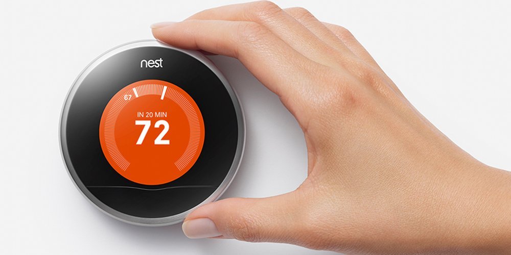
Ten years ago, when Bould Design was beginning to grow and deeply engaged with start-ups like Nest, GoPro and Roku, I started thinking about how to define and easily share our design values as the team expanded. Clients were telling us that we had a refreshing, no-nonsense point of view and that they loved working with us. I wanted to make sure this feeling did not get lost as we expanded. The ideas needed to be simple, easy to explain, and sticky. To scale our design process, I scanned for patterns in our most successful projects.
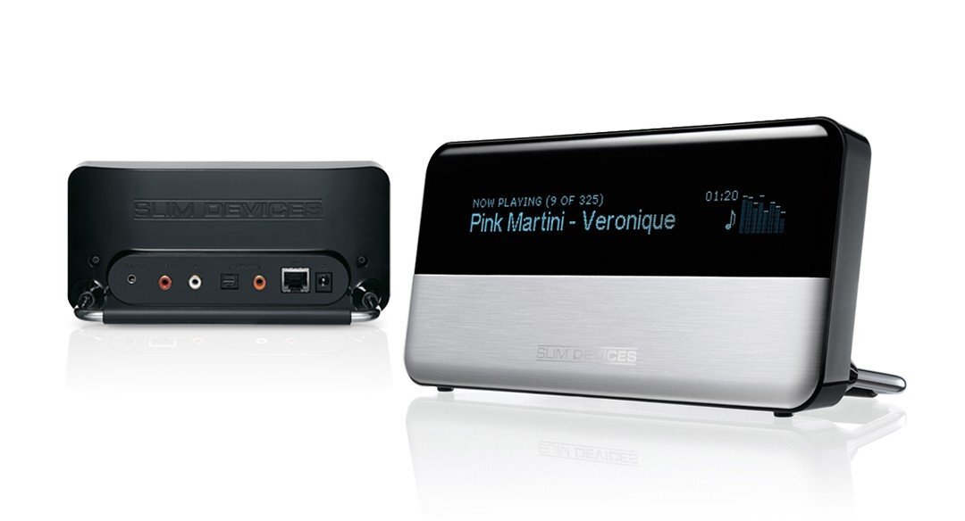
There was one early project in particular that really captured the essence of what we were trying to do. The client, Slim Devices, had a first product that they had designed themselves. It was getting great technical reviews and despite the lackluster design, they achieved modest success selling a somewhat bleeding edge consumer electronics product with a three hundred dollar price tag.
One of their board members suggested that design, or lack thereof, was holding them back and they should engage with an industrial designer. They approached a number of big Silicon Valley design studios where, as a twelve person, boot-strapped hardware start-up, they were deemed too small an opportunity. However, an engineer at one of these firms knew me and sent them my way. I was an independent designer working out of a tiny warehouse space in Mountain View just down the road from the emerging Google campus.
Their team consisted of a group of hyper talented technical virtuoso’s, mostly software and electrical engineers, not atypical for a Silicon Valley start-up. The lead software engineer appointed himself as the liaison for the industrial design. We shared a love of Indian food and got along well. Our weekly meetings were often held in a booth at Saravana Bhavan, a spectacular Indian restaurant in Sunnyvale.
I had a feel for where the design might go from an aesthetic point of view and put together some initial concepts based on the existing component architecture. But the concepts rang hollow and felt like putting lipstick on a pig. So, we stepped back and questioned all the decisions they had made on their current product. We drilled in on every single functional aspect of the form factor and color, material and finish. We took all the internal components and re-oriented them according to the user's needs first, and the electrical engineer’s second. In doing so, we discovered some really simple geometric relationships with a huge impact on the usability and aesthetics of the device. When we were finished, a new, very compelling form factor had emerged. It just made sense and it worked and looked great.
On day one, the new design outsold their previous product by a factor of three. No internal components or software had changed, design alone accounted for a two hundred percent increase in revenue. Tellingly, women now figured more prominently in their customer base and, as an added bonus, the product was also less expensive to produce. David Pogue’s New York Times product review said “Its creators have sweated so many details, you want to hand them a towel.” It was an unqualified win for the Slim Devices and they were acquired by Logitech shortly thereafter.
In analyzing the process, four principles emerged that funneled our design process towards success. These principles were function, simplicity, quality, and character. In that order. Deliver a product that works how people want it to work, is easy to understand and use, is well built, yet economical, and has the right tone and character. If we do this well, the results are timeless products that delight users and inspire brand loyalty. I started to break each principle down so that I could easily share it with our growing team.
Function
Function is the base of the pyramid. I began telling our designers that function is first and that it doesn’t matter what something looks like until we’ve solved how it works (this makes some designers very uncomfortable). We have to think of function in extremely broad terms that go beyond the day to day user experience.
Context is key. Great functional outcomes flow from understanding as much as possible about the demands on the user’s physical and cognitive abilities and their environment. Are they using a Roku remote control to select a Netflix movie while sitting on a sofa in their living room in the dark with their other half on a friday night or a Logitech presenter to make an hour long presentation on stage to a critical audience of five hundred people early monday morning at the annual sales meeting? Drilling down into the minutiae of the interaction uncovers needs that translate directly into form, feel, cognition and dynamics. We are choreographing an experience, and hopefully a smooth, natural, functional flow.
In addition to the context, understanding the technology is paramount. Good designers understand technology and how to seamlessly integrate it into a compelling user-centric experience. They understand the why’s and how’s of arranging components towards a functional outcome and strive to develop efficient, logical architectures that realize the full potential of the technology. This is also part of our function mindset.
In order for the functional promise of the product to be fulfilled, it must be manufacturable and that is why our take on function extends to the factory. Are we making reasonable asks that lead to high repeatability, quality and economy or unreasonable asks that lead to defects and waste? Function needs to cover all aspects of the product life cycle, including manufacturing.
Finally, looking into the future, what is the state of the product five years after deployment. Does it still work flawlessly? Have the finishes held up to the rigors of the environment? Do people still enjoy interacting with it as they did on day one? If these issues are addressed during the design process, the answers will be yes.
Simplicity
Simplicity is when you cannot rationalize adding to or removing anything from the design. You have distilled the design down to its most basic essence and arrived at a purity that speaks clearly to the user. It tells them that you have taken the time to understand their needs at a very deep level and have translated that understanding into the physical object before them.
Achieving simplicity starts with an understanding of how what’s possible maps onto what is needed. Just because you can incorporate a function or feature, does not necessarily mean that you should. Will the user truly appreciate and use the feature or will it be something that is ignored and consumes resources that could be used to make a more essential feature work even better? Decisions made in product planning often determine whether true simplicity will be achieved.
Simplicity is more than skin deep. Attempts at simplicity that gloss over function do not yield simplicity but complication as they make something harder to use. Ergonomics matter. The carefully sculpted ergonomic feature usually trumps the ‘iconic’ rectilinear monolith with the opaque usability story. A remote control that people hold upside down on the first try is not simple.
Quality
When it has a voice, quality speaks for itself. If you understand the function of the product and the proposed manufacturing processes on a deep level, you also understand the quality level that is possible. This drives strategy on tooling, assembly, color, material, and finish. All those things that when combined yield a sense of refinement, durability… quality. High quality does not necessarily equate with high cost. Some of the highest quality products that we design are also the most accessible.The key is understanding both the processes and the people behind the production.
Character
When it comes to character, the design must reflect the user’s values first and foremost. Their internal dialogue should be “you people get me. thank you.” Next in line is our client or the producer of the product. Does the design closely align with and leverage their unique values? Are we adding to their reservoir of brand equity? Finally, is the design a reflection of our values as designers? Does it meet our aspirations for expression and aesthetic refinement? Our experience is that when the function, simplicity and quality are all present, the character can be a light touch, a whisper.
The studio has grown quite a bit since the Slim Devices days and the world has changed as well. Nest was acquired by Google and continues to develop beautiful hardware on their own. GoPro is a household name and Roku is a multi-billion dollar public company that leads the streaming entertainment market. What hasn’t changed is the effectiveness of these core principles in our day-to-day design process. We still hear from new clients that our approach is refreshingly no-nonsense and that they love working with us.


